- 🎆Link Dump July 4th🎆🦍Thick and Thin🦒 Nickels are too thin! You know what you need? Thicker nickels, or thnickels. This is a cool thin ‘pencil tower’ in New York. It has no load-bearing interior columns, relying on its ‘concrete exoskeleton’. 🧠Illusion of Thinking for Yourself🧠 I find Apple’s Illusion of Thinking paper refreshing and I enjoy the term ‘accuracy collapse’ and will try to shove it into cocktail party conversation whenever possible. Anthropomorphizing AI/LLMs is something that I’m hoping society will course correct over time, but I’m not holding my breath. Adam Conover has an insightful piece about AI making us dumber. Neal… Read more: 🎆Link Dump July 4th🎆
- Fizz & Buster: Sketches
 As part of my Fizz & Buster series, I made a bunch of sketches during the process. Some were created before and some after as I planned on continuing the project into potentially a larger adventure game. But it didn’t really get off the ground for various reasons. I wanted to flesh out Fizz’s world a bit and create a cast of fun characters that you could interact with. Fizz & Buster Our hero Fizz and his space dog Buster travel the Olympus Belt, finding adventure when they least want it! Usually right around suppertime unfortunately. Fizz uses his Flinger… Read more: Fizz & Buster: Sketches
 - Cycling in Arizona Heat
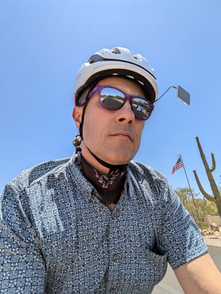 In my travels I have been close to hypothermia, and I’ve also been close to heat stroke. The difference between the two is that people seem to know more about preparing for the cold than the heat. In both situations I try to be aware of the dangers and be prepared. I generally commute by bike here in sunny Tucson, Arizona, and so I wanted to throw down my thoughts about how I survive in our extreme temperatures. So do I bike year round? Yep. In the heat? Yep. Is that crazy? Not if you know what you’re doing and… Read more: Cycling in Arizona Heat
 - Bulk La Croix: Carbonating your own sparkling water.At one point, sparkling water was one of the most expensive and wasteful food products we were purchasing. Shipping the water from the canning facility is a major cost. The environmental cost of the trucks and fuel is in my opinion even worse. Then there are the aluminum cans: we were drinking a couple cans a day, two people, that’s 28 cans a week! It adds up so quickly and our recycling bin was filling up quickly. There has got to be a better way! Early Experiment: The Sodastream If you want to make carbonated water at home, then why… Read more: Bulk La Croix: Carbonating your own sparkling water.
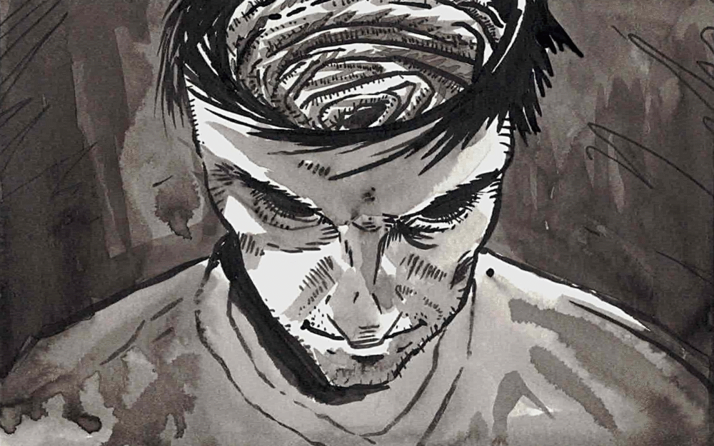
- Fizz & Buster – Part 4Part 1 is here. This is part 4 in a short series of drawing from an old Inktober of mine. Click on the first image to enter lightbox mode, and enjoy! The End! Its a fun, light series, I enjoyed drawing it, I hope you enjoyed it as well. I’ll post a few additional character drawings here soon. Thank you!
Congratulations, you have found the enemy hideout! This site is full of my musings, art, and code. Enjoy!